Taylor
Tidwell
Denver,
Colorado
Product
Designer
Product
Designer
Product
Designer
I’m a designer driven by an unhealthy addiction to creative problem-solving & crafting intuitive designs. I create playful interactions that amplify business impact and build powerful UIs that turn raw data into meaningful action.
I’m a designer driven by an unhealthy addiction to creative problem-solving & crafting intuitive designs. I create playful interactions that amplify business impact and build powerful UIs that turn raw data into meaningful action.

01
My Work
My Work
My Work
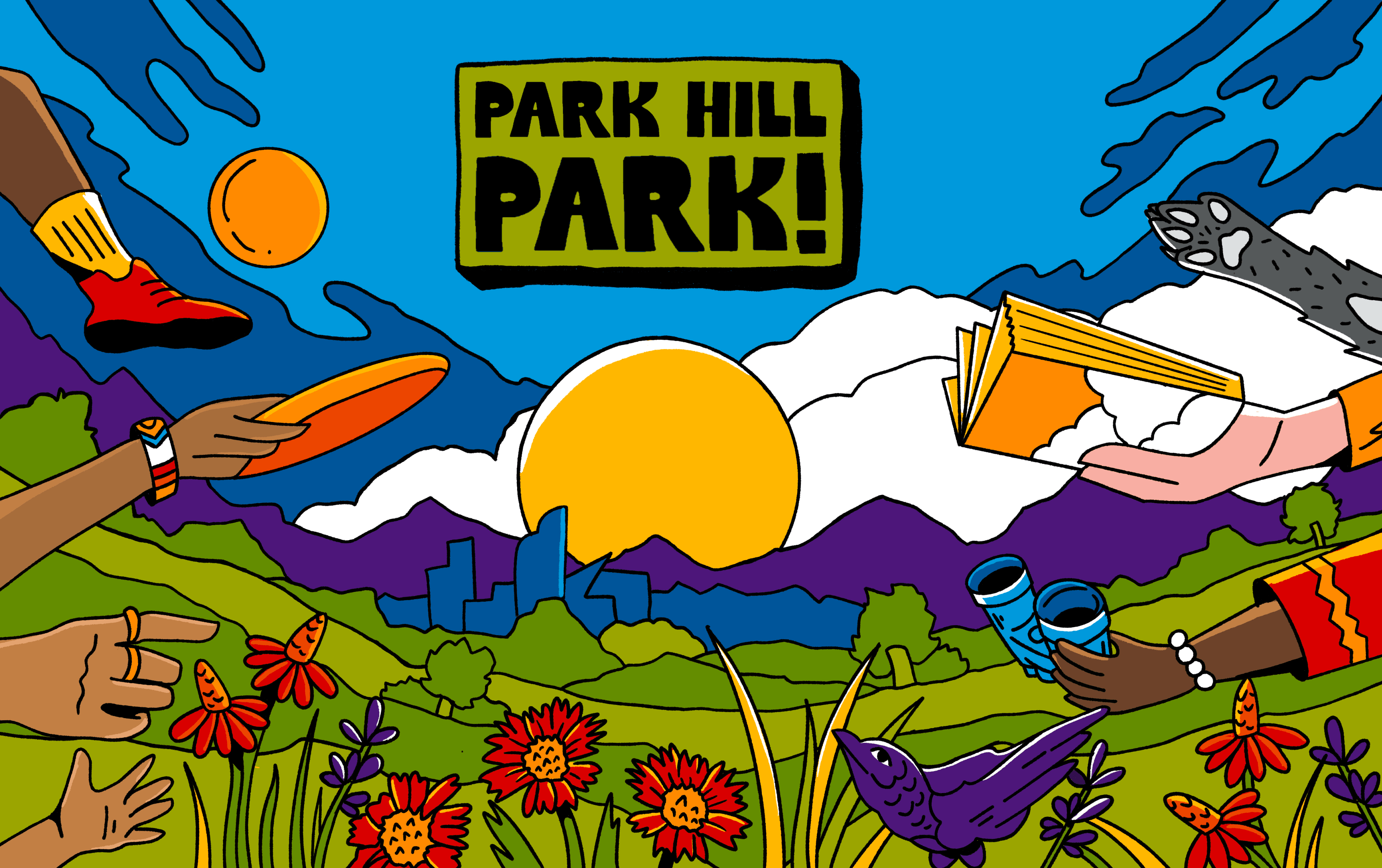
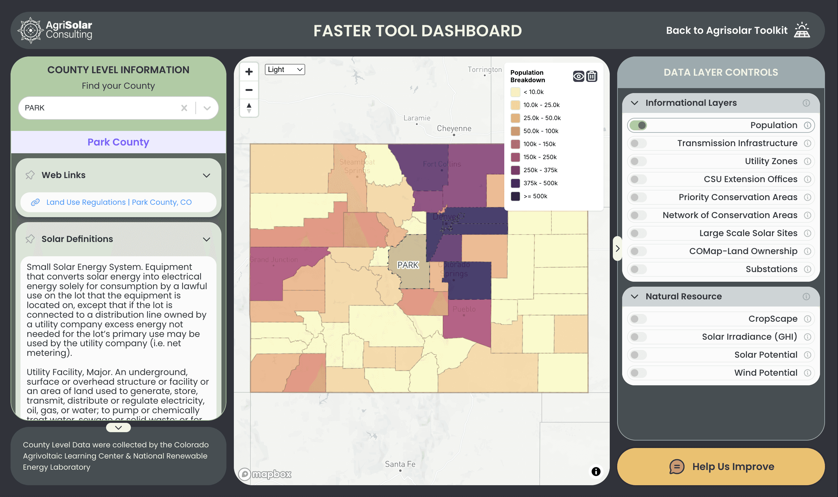
Dashi
SaaS
Data Visualization Dashboard
Web App
Product
Coming Soon
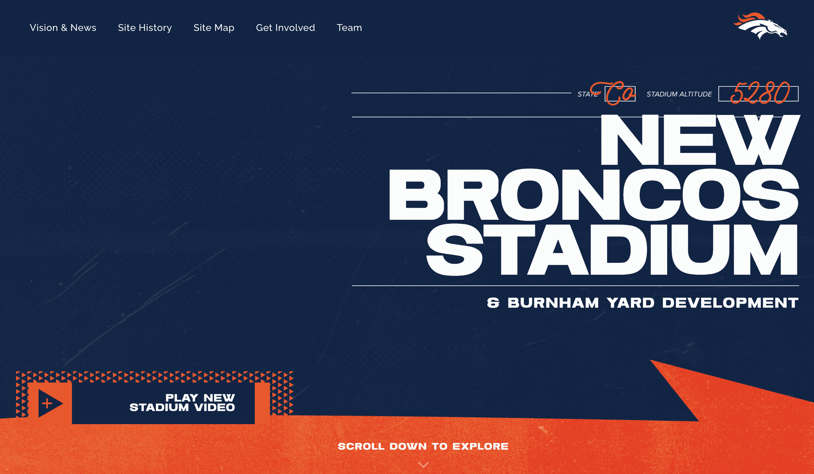
Office Shift Pro
SaaS
Powered by Machine Learning
Web App
Product
Coming Soon
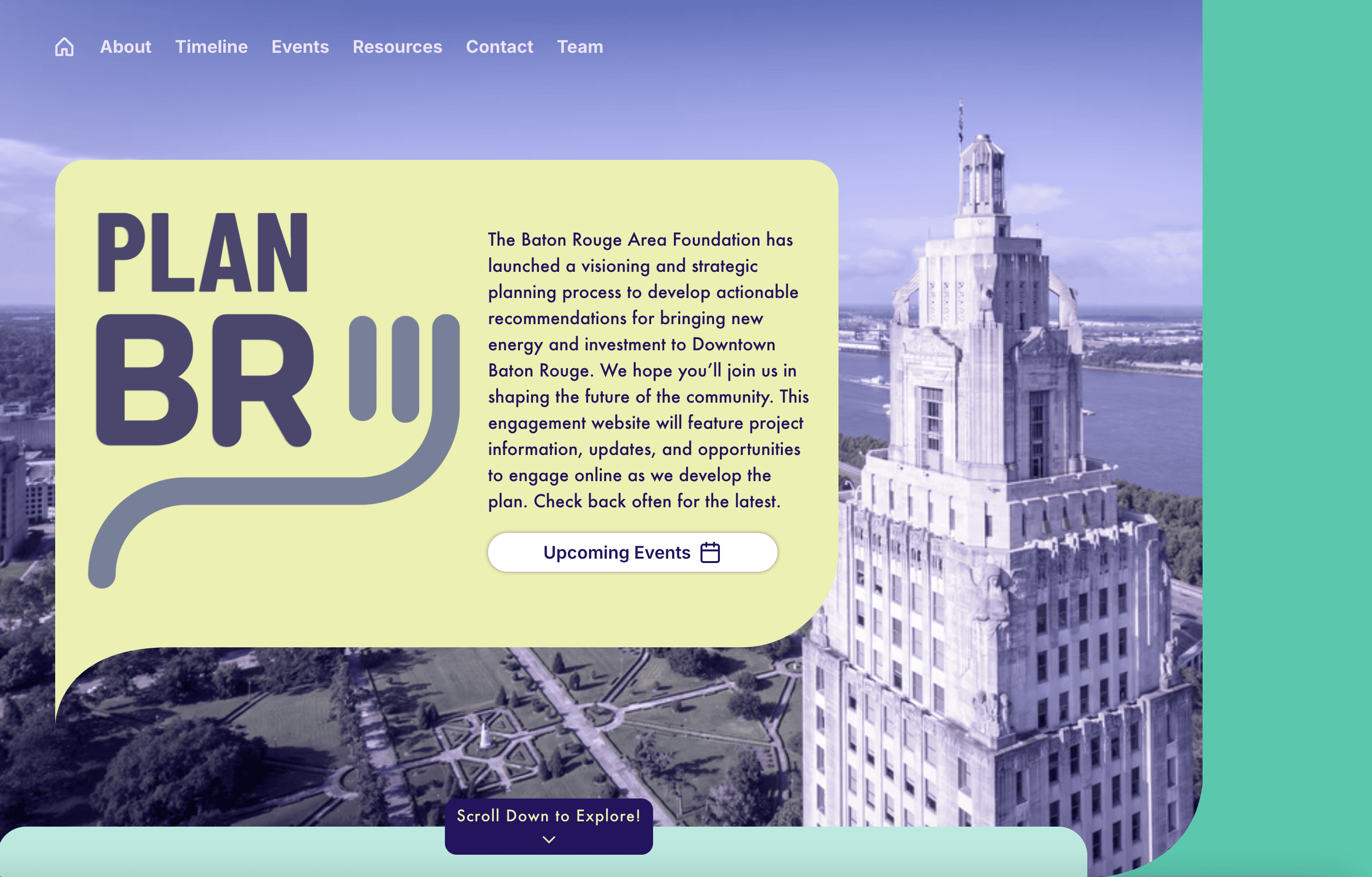
User Research Repository
User Research
Notion Database
Coming Soon
Powder Design System
Design System
React
Chromatic
Dashi
SaaS
Data Visualization Dashboard
Web App
Product
Coming Soon
Office Shift Pro
SaaS
Powered by Machine Learning
Web App
Product
Coming Soon
User Research Repository
User Research
Notion Database
Coming Soon
Powder Design System
Design System
React
Chromatic
Dashi
SaaS
Data Visualization Dashboard
Web App
Product
Coming Soon
Office Shift Pro
SaaS
Powered by Machine Learning
Web App
Product
Coming Soon
User Research Repository
User Research
Notion Database
Coming Soon
Powder Design System
Design System
React
Chromatic
02
Design Approach
Design Approach
Design Approach
Identify
Unearthing problems & opportunities, not just feature requests.
At the start of any project, I focus on understanding the problem, not just what it is, but why it matters, and to whom. I distinguish bugs from UX friction, and always ask how the issue impacts the business and where new opportunities might exist.
My most powerful tools here are user interviews and workshops. Data can show you what’s happening, but talking to people reveals the why. Workshops let users co-create and unpack the full scope of a problem, often leading to surprising insights.
I know I’ve correctly identified a core problem when:
I can clearly describe the impacted user group
Personas and use cases naturally emerge
The data, feedback, and business case all align
Example: We once designed Dashi with a one-project-to-one-asset structure. After user testing and workshops, we realized we needed a many-to-many architecture, one that supports grouped assets, nested projects, and dependencies. That insight reshaped our entire data model and opened the door to more scalable features.


Plan
Bridging user needs, technical constraints, & product goals.
Planning happens with the full team, not in a vacuum. We always begin by synthesizing user research, then map it to design and engineering tasks together. From there, we align on a delivery target and work backward to structure sprint blocks and technical milestones.
Feature prioritization is a living, collaborative process. We’re constantly engaging with users, comparing new requests against our backlog, and evaluating requests based on value, urgency, and scalability across clients.
I believe in constant communication. At minimum, I speak with devs twice a day and stay in lockstep with our PM. Skipping check-ins leads to misalignment. I learned this the hard way when I once shipped an attribute module design that totally clashed with our data model. It took two weeks of back-and-forth to fix what could’ve been solved in one conversation.
We use user flows, journey maps, and design frames to communicate architecture, not just interfaces. When diagrams get unwieldy, I’ll prototype flows visually to help engineers see intent, transitions, and edge states clearly.
Execute
Designing with precision, clarity, & care.
To me, craft = clarity. A clean frame tells a story. A sloppy one obscures it. Whether I’m building interaction logic or a spec handoff doc, I aim for organized, intentional work that communicates why as clearly as what.
Design systems are key here. Our internal system (Powder) allows us to move fast and stay consistent. But I never trade speed for thoughtfulness. Fast ≠ rushed. Good execution means balancing iteration speed with intentionality and tight team feedback loops.
Stakeholder alignment is constant, not just a review at the end. I share early and often, knowing that small course corrections early on prevent painful last-minute rework.
Execution means different things depending on the project stage:
Exploratory → low-fidelity wireframes
In production → polished UI, prototyping, dev specs, and annotations
My Tools:
Daily standups
“Team table” Zoom channels for collaboration
Custom spec templates + annotations in Figma
GitHub for sprint cycles
FigJam for team workshops
Iterate
Listening, refining, evolving.
Iteration doesn’t end at handoff. It’s baked into how we ship.
Every new deployment brings a new wave of feedback. We troubleshoot and evolve in real-time, always weighing new requests against roadmap priorities and product-wide scalability. If a single client asks for a feature, we float it with others, if it resonates, we shift.
But iteration isn’t just reactive, it’s strategic. We’re constantly balancing what users say they want with what we see in the data, and what makes sense long-term for product growth.
How do we define “done”?
Does it meet the MVP scope?
Is it overbuilt for the users needs?
Can we defer complexity to a future release?
Example: On our R&D tool MapPie, we started with a plugin inside Rhino 3D. But as we iterated, we realized embedding outputs inside the modeling space was too limited. We rebuilt the product as a full web app with a live hook into Rhino, giving us full design system control and a smoother user experience.
03
Contact
Contact
Contact
04
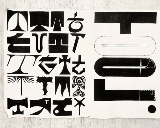
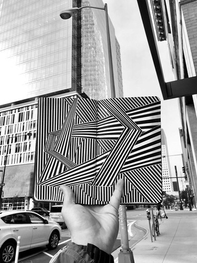
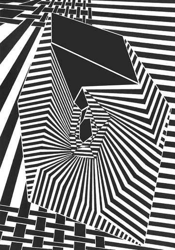
Creative Residue
Creative Residue
Creative Residue
Website Design
p5.js Sketches

Drawings


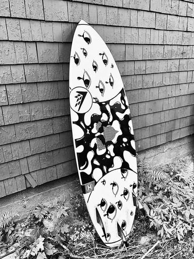

Sculpture


Taylor
Tidwell
Denver,
Colorado
Product
Designer
I’m a designer driven by an unhealthy addiction to creative problem-solving & crafting intuitive designs. I create playful interactions that amplify business impact and build powerful UIs that turn raw data into meaningful action.
01
My Work
Dashi
SaaS
Data Visualization Dashboard
Web App
Product
Coming Soon
Office Shift Pro
SaaS
Powered by Machine Learning
Web App
Product
Coming Soon
User Research Repository
User Research
Notion Database
Coming Soon
Powder Design System
Design System
React
Chromatic
02
Design Approach
Identify
Unearthing problems & opportunities, not just feature requests.
At the start of any project, I focus on understanding the problem, not just what it is, but why it matters, and to whom. I distinguish bugs from UX friction, and always ask how the issue impacts the business and where new opportunities might exist.
My most powerful tools here are user interviews and workshops. Data can show you what’s happening, but talking to people reveals the why. Workshops let users co-create and unpack the full scope of a problem, often leading to surprising insights.
I know I’ve correctly identified a core problem when:
I can clearly describe the impacted user group
Personas and use cases naturally emerge
The data, feedback, and business case all align
Example: We once designed Dashi with a one-project-to-one-asset structure. After user testing and workshops, we realized we needed a many-to-many architecture, one that supports grouped assets, nested projects, and dependencies. That insight reshaped our entire data model and opened the door to more scalable features.
Plan
Bridging user needs, technical constraints, & product goals.
Planning happens with the full team, not in a vacuum. We always begin by synthesizing user research, then map it to design and engineering tasks together. From there, we align on a delivery target and work backward to structure sprint blocks and technical milestones.
Feature prioritization is a living, collaborative process. We’re constantly engaging with users, comparing new requests against our backlog, and evaluating requests based on value, urgency, and scalability across clients.
I believe in constant communication. At minimum, I speak with devs twice a day and stay in lockstep with our PM. Skipping check-ins leads to misalignment. I learned this the hard way when I once shipped an attribute module design that totally clashed with our data model. It took two weeks of back-and-forth to fix what could’ve been solved in one conversation.
We use user flows, journey maps, and design frames to communicate architecture, not just interfaces. When diagrams get unwieldy, I’ll prototype flows visually to help engineers see intent, transitions, and edge states clearly.
Execute
Designing with precision, clarity, & care.
To me, craft = clarity. A clean frame tells a story. A sloppy one obscures it. Whether I’m building interaction logic or a spec handoff doc, I aim for organized, intentional work that communicates why as clearly as what.
Design systems are key here. Our internal system (Powder) allows us to move fast and stay consistent. But I never trade speed for thoughtfulness. Fast ≠ rushed. Good execution means balancing iteration speed with intentionality and tight team feedback loops.
Stakeholder alignment is constant, not just a review at the end. I share early and often, knowing that small course corrections early on prevent painful last-minute rework.
Execution means different things depending on the project stage:
Exploratory → low-fidelity wireframes
In production → polished UI, prototyping, dev specs, and annotations
My Tools:
Daily standups
“Team table” Zoom channels for collaboration
Custom spec templates + annotations in Figma
GitHub for sprint cycles
FigJam for team workshops
Iterate
Listening, refining, evolving.
Iteration doesn’t end at handoff. It’s baked into how we ship.
Every new deployment brings a new wave of feedback. We troubleshoot and evolve in real-time, always weighing new requests against roadmap priorities and product-wide scalability. If a single client asks for a feature, we float it with others, if it resonates, we shift.
But iteration isn’t just reactive, it’s strategic. We’re constantly balancing what users say they want with what we see in the data, and what makes sense long-term for product growth.
How do we define “done”?
Does it meet the MVP scope?
Is it overbuilt for the users needs?
Can we defer complexity to a future release?
Example: On our R&D tool MapPie, we started with a plugin inside Rhino 3D. But as we iterated, we realized embedding outputs inside the modeling space was too limited. We rebuilt the product as a full web app with a live hook into Rhino, giving us full design system control and a smoother user experience.
03
Contact
04
Creative Residue
Website Design
p5.js Sketches
Drawings
Sculpture